NACAS
Enriching the Campus ExperienceWe built a brand to reposition an association, reinforce its leadership posture, and communicate its true audience focus and impact on improving the lives of students. As a trade association for college auxiliary services, NACAS represents the interests of the many non-academic services found on a campus – from bookstores, to dining, to housing, to parking & transportation, and everything in between. With higher education institutional members, and corporate Business Partners, NACAS serves as a junction for schools to source the services they require to advance their campus ecosystem and serve students. The former NACAS tagline, “The Connections that Count”, spoke to this positioning, and the overall messaging painted a picture of an umbrella organization that accommodates all professionals working in auxiliary services. While these communications were certainly authentic to the organization, they didn’t differentiate NACAS enough from other associations both in and out of the higher education market.
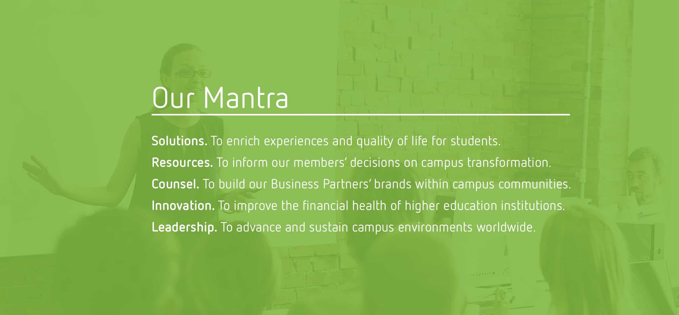
Through robust discovery work, Mekanic identified the true core audience of NACAS: senior auxiliary service leaders who oversee multiple services, behave as visionaries, demonstrate business acumen, and have the buying power to make executive decisions that transform campus environments. Additionally, the primary motive for working in their profession was the impact of their work on improving the quality of life for students. We learned that revenues generated from auxiliaries are reinvested into the school in the form of upgraded services and experiences that students need and desire.
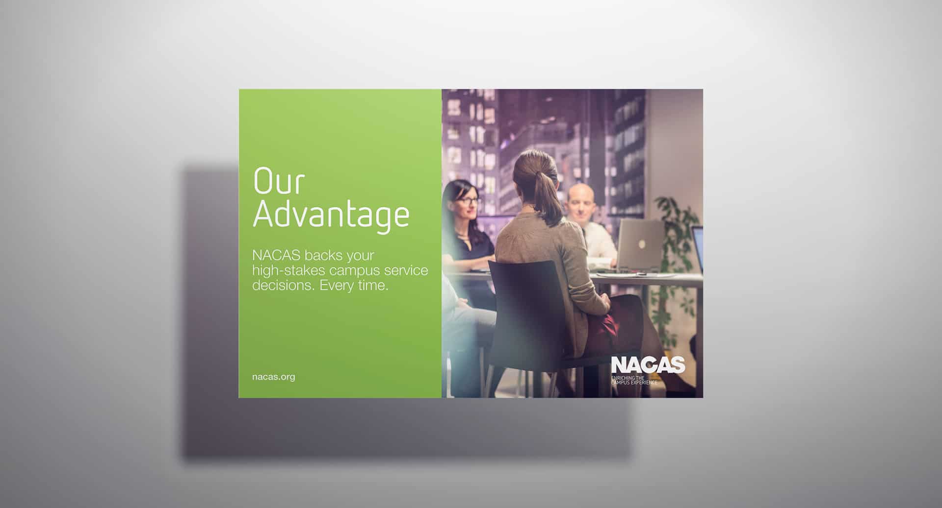
Armed with this information, Mekanic created a new tagline to communicate the brand promise of NACAS: “Enriching the Campus Experience”. We shifted the focus of the brand messaging from making deals and transactions to the creative and progressive solutions that are essential to achieving real campus transformation and student success. A new visual identity gave NACAS a fresh, bold market presence, with green as a central tone representing regeneration and the financial impact of auxiliary services on their institutions, and emphasizing the “C” to communicate an intentional focus on the campus community and how the work of NACAS members positively affects all aspects of this community. The entire brand system breathed new life into NACAS with a more meaningful story and worked swiftly to elevate its market position and improve member recruitment and retention efforts.
Services Rendered
Brand Strategy
Business Operations
Brand Messaging
Visual Identity Design
Digital Strategy
Web Design & Development
Product Architecture
Experience Design
Digital & Social
Campaigns & Marketing