Millennia
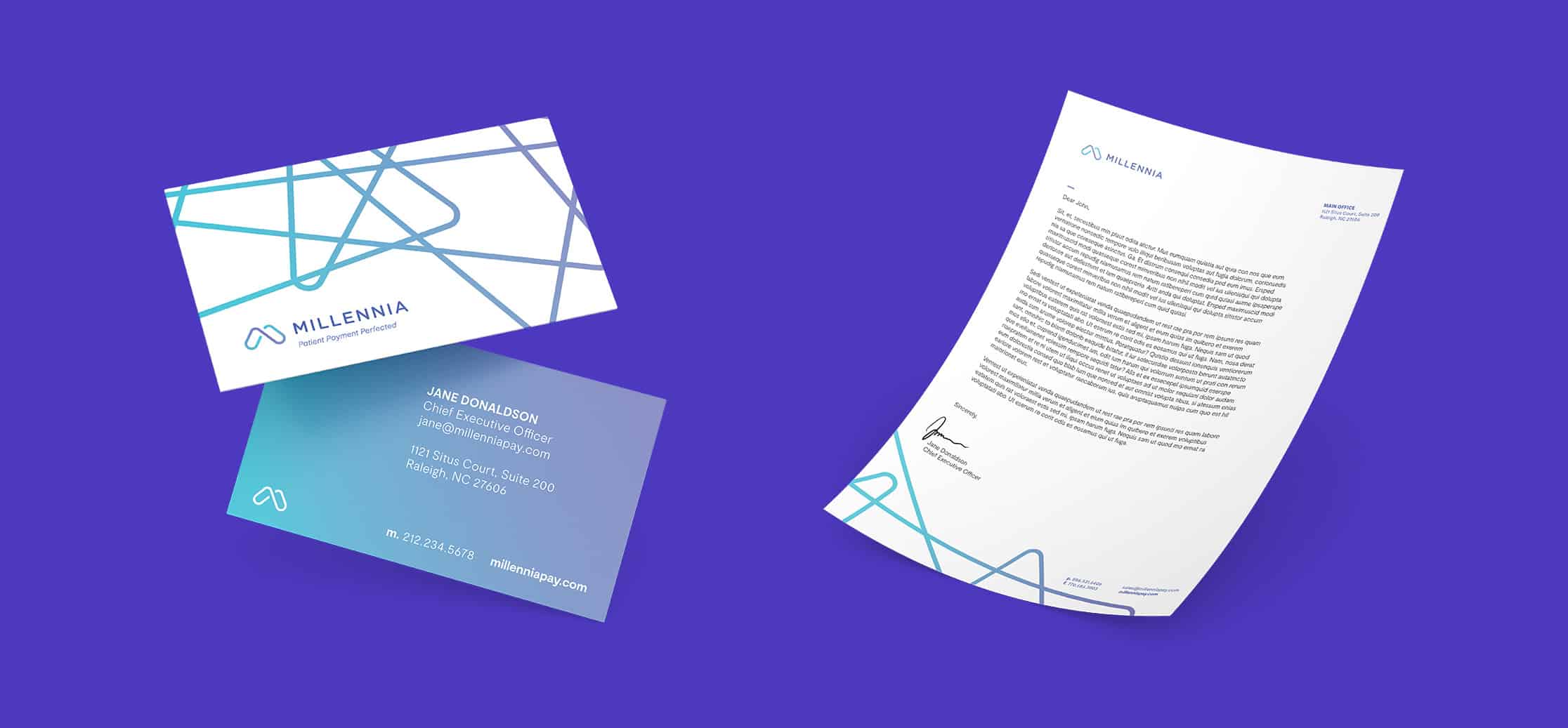
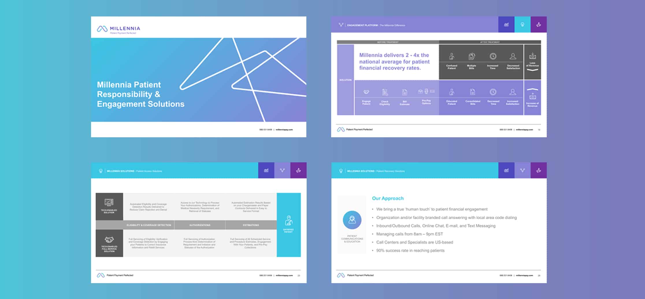
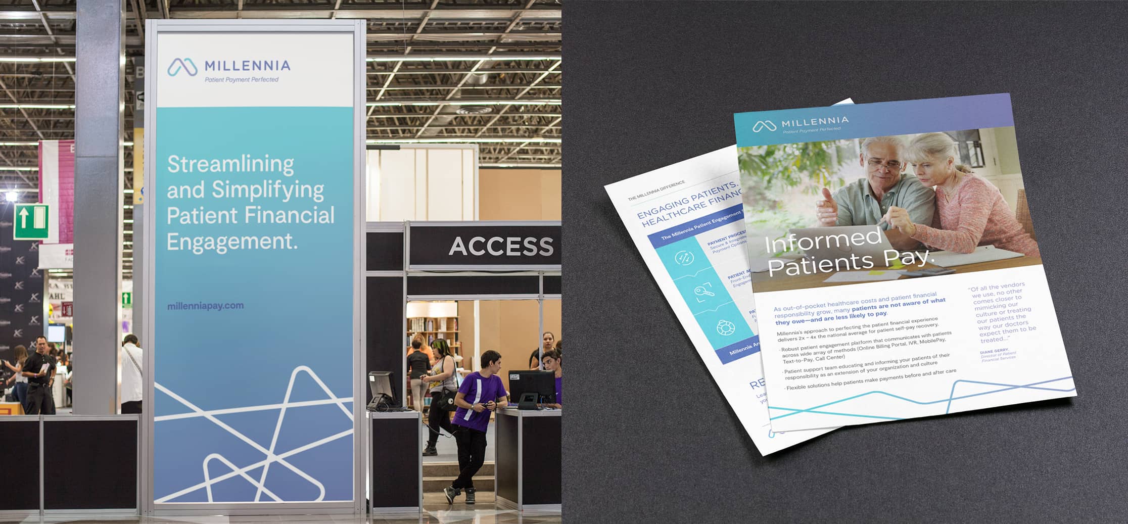
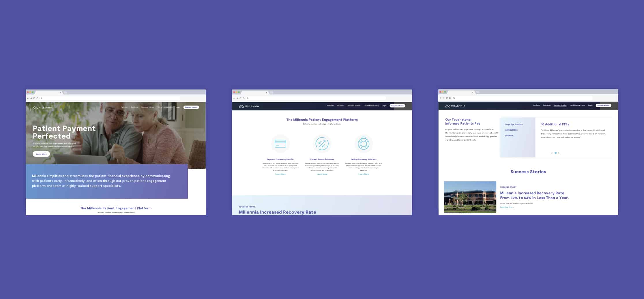
Like any business expanding and updating its service offerings to serve client needs better, Millennia needed a refreshed brand identity system to reflect the next phase of its business. Through our Brand Kamp discovery process, Mekanic learned that what differentiates Millennia from other healthcare financial technology companies is the human touch that their team of patient support specialists adds to the patient and provider experience. As Millennia’s new patient engagement platform expanded to improve patient satisfaction and financial recovery, Mekanic prioritized the company’s empathetic and educational approach in the brand story and designed a visual identity that embodies the company’s fluidity and flexibility that allows them to provide exceptional service to their clients and patients. The new “M” shape of the brand mark is a rendering of the infinity symbol depicting how Millennia acts as an extension of a healthcare provider’s brand. A gradient of vibrant purples and cyan blue throughout the visual identity situate the brand within the broader health-tech space. Millennia continues to partner with Mekanic on updating its web presence to improve the user experience.