Lightility
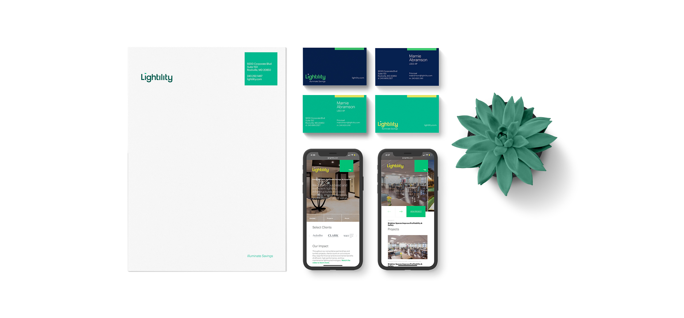
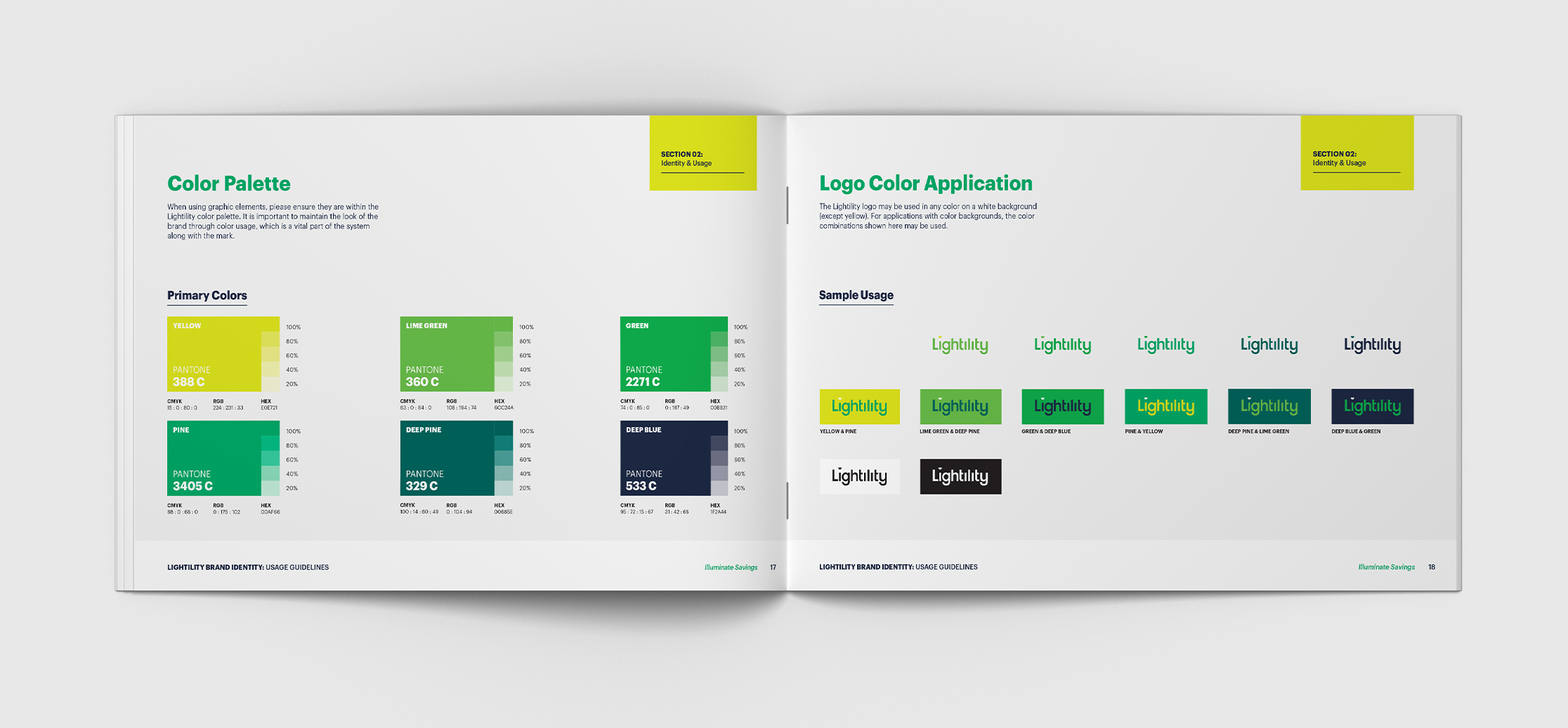
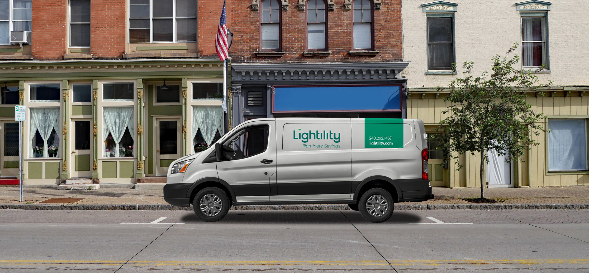
Lightility acts as a consultative partner helping organizations benefit from financial and energy savings through sustainable lighting upgrades. After adopting a new name to reflect a maturing business, Lightility went through Mekanic’s Kamp process to redefine its value proposition, prioritize target audiences, and evolve its visual identity. Mekanic developed core brand messages to engage Lightility’s target audiences in distinct and meaningful ways, refined the existing logo, and designed a complementary visual identity system that can be applied consistently across all channels. To position Lightility as a comprehensive partner and problem solver operating at a national level, Mekanic developed compelling visuals and digestible messaging to help Lightility’s sales team communicate their results-driven process. Mekanic continues to support the development of Lightility’s maturing brand through the design and development of a new website.

Process
When it began the Brand Kamp process, Lightility had recently adopted a new name to reflect its maturing business. It set out to redefine its value proposition to attract clients with a national footprint, to clarify key messaging strategies for different audience segments, and to evolve its visual identity toward a sophisticated new aesthetic. As Lightility began demonstrating its enterprise-level capabilities to new clients, we designed a brand system to match the organization’s growth.

Execution
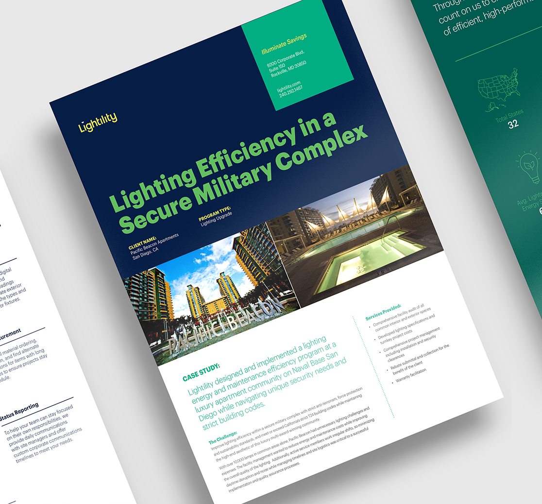
To position Lightility as a comprehensive partner and problem solver operating at a national level, Mekanic developed compelling visuals and digestible messaging to help Lightility’s sales team easily communicate their results-driven process. We made subtle updates to the brand logo, enhanced the color palette, and filled out the brand system to ensure consistent application over time. We developed a fresh brand story around the idea that Lightility is a comprehensive partner that finds new ways for businesses to save sustainably over time—without the surprises or headaches of other property management and maintenance vendors. We applied new taglines and top-line messages throughout the website and sales enablement tools.
We redesigned and developed the website to bring Lightility’s thorough approach into the limelight. We developed a custom suite of iconography to distill their impressive project specifications, cost savings data, and sustainability metrics into an easily-skimmed format. We mapped out their process with an interactive visual treatment that illustrates their comprehensive approach and brand differentiators. The new process map and case study treatments have become the centerpieces of the new website and sales enablement tools, showing how a unique partnership model can drive significant cost savings while reducing carbon footprints simultaneously.
