NHPCO
We built a brand to match bold aspirations. NHPCO represents hospice and palliative care organizations throughout the United States, offering leadership and resources for providers and professionals caring for people affected by serious and life-limiting illness, and advocacy for the proven hospice model.
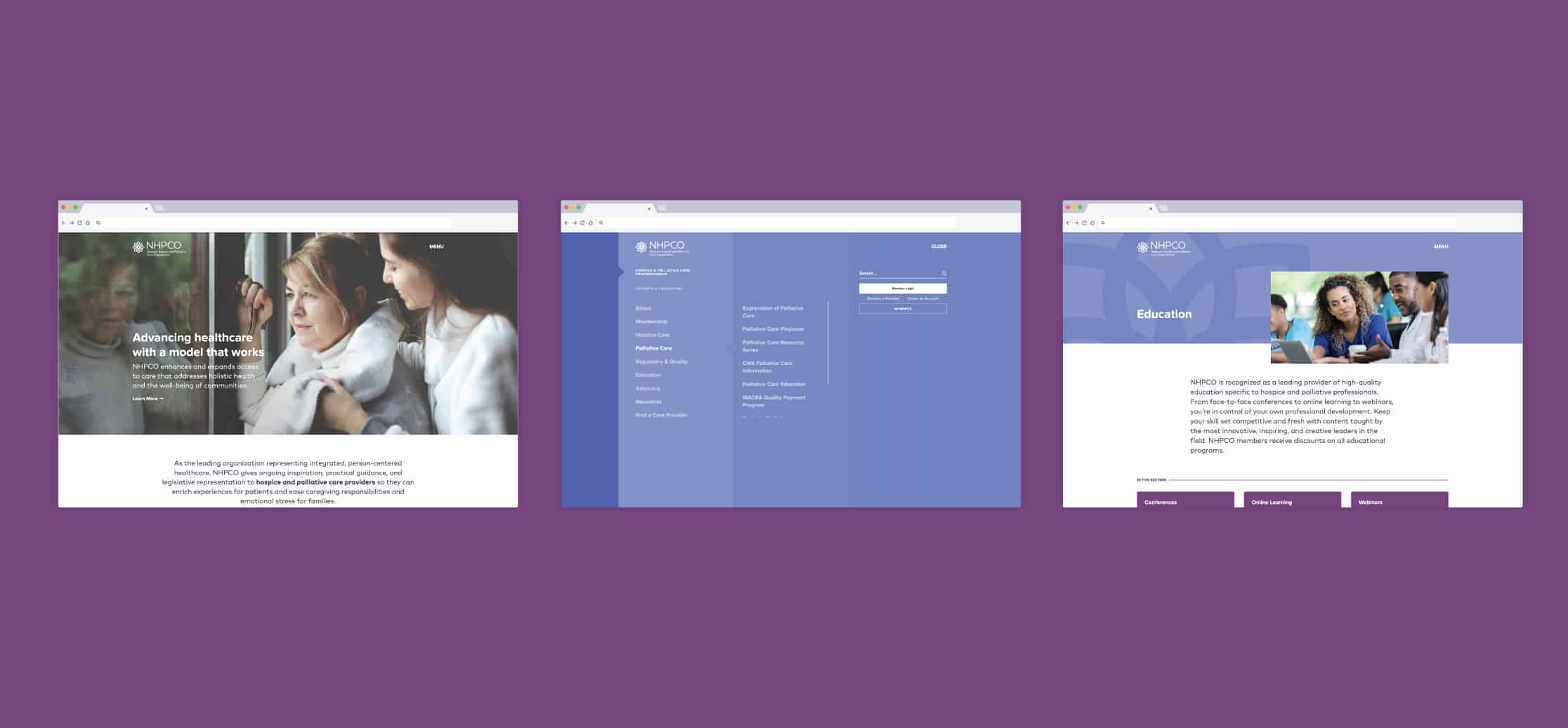
NHPCO aspires to be a catalyst of positive change in the healthcare industry, and we were eager to build a brand system that would embody and support such an important organizational goal. After several months of research, ideation, and co-creation, NHPCO is unveiling a new brand system that crystallizes its role as the forward-thinking advocate for person-centered care. With refreshed core brand messaging tailored to its core audiences, elevated design touchpoints to bring consistency and drive engagement, and a well-honed North Star statement to articulate its long-term aspirational goals, NHPCO is better positioned to champion and celebrate the compassionate work its members contribute to their communities daily.

Closing the care gap in health services.
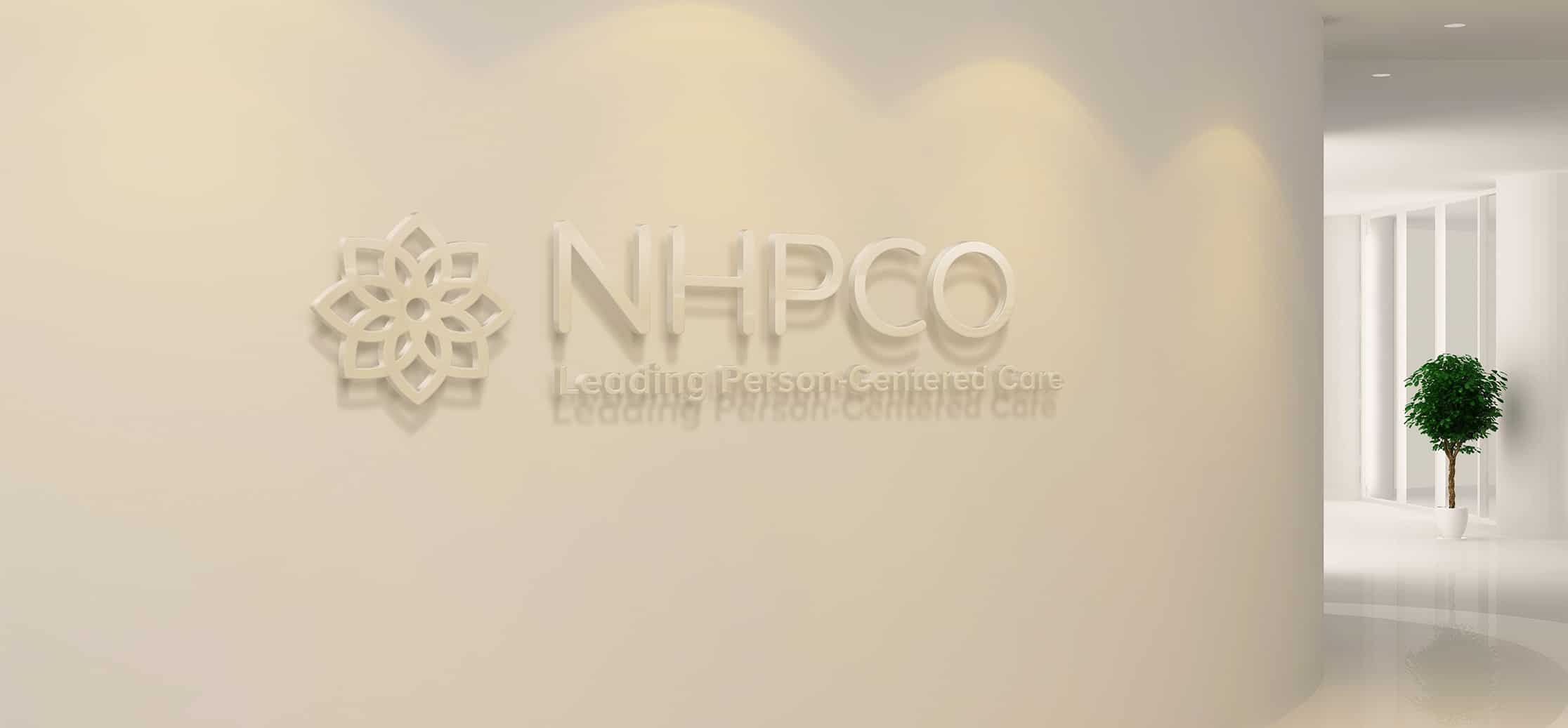
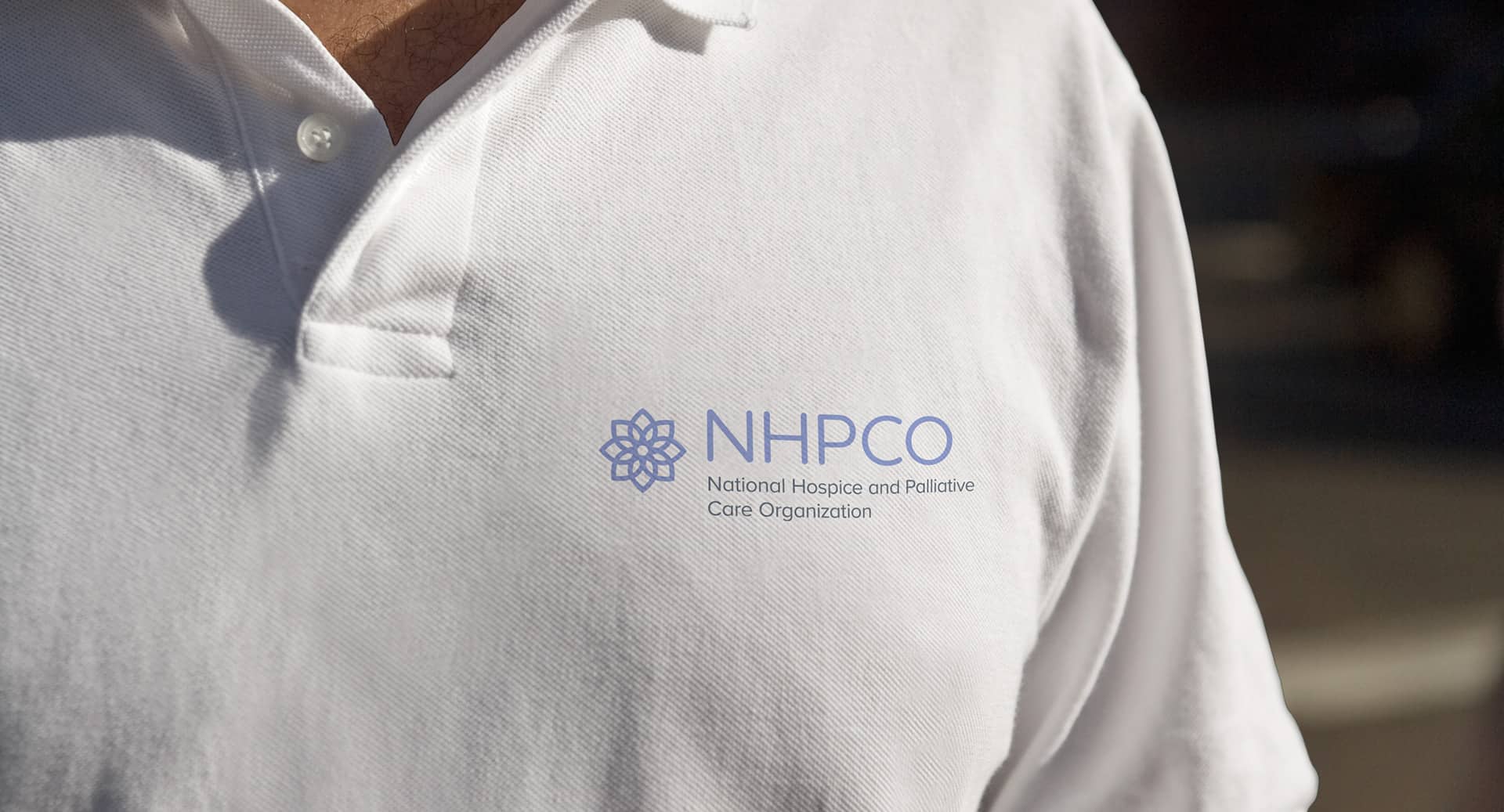
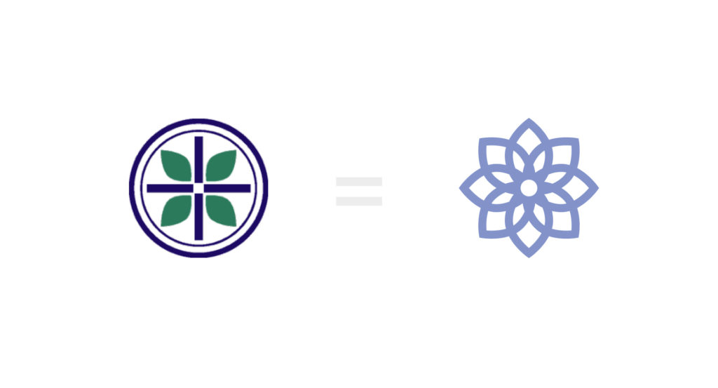
NHPCO’s North Star speaks to its boldest aspiration: to advance the proven, interdisciplinary, person-centered care model across the broader healthcare industry. As a visual representation of this aspiration, we preserved and updated the logo mark of NHPCO’s traditional lotus to represent the integration of mind, body, and spirit in person-centered care. The white center is a shining light, representing hope, life, and love: hope in relief of symptoms; life, not in extension, but in enhancement; and love shared. Around this center, petals grow larger as they extend outward, representing the layers of caregivers, loved ones, and community dedicated to each patient. A periwinkle color selection conveys a state of serenity that person-centered care models help to achieve, as well as the approachable leadership posture of NHPCO. Rounded letterforms show the communal quality of the organization as it works alongside hospice organizations and providers to seek out the best solutions for their patients and communities.
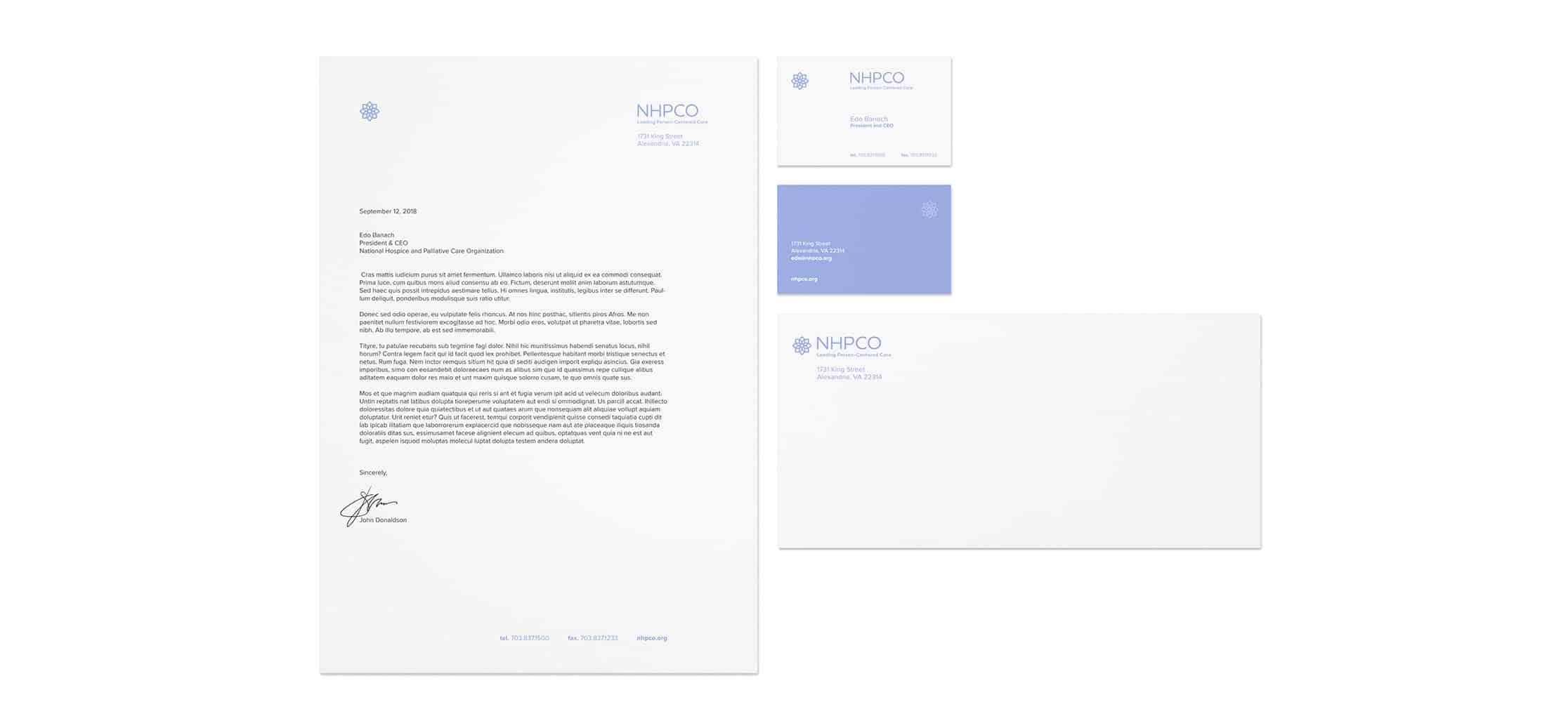
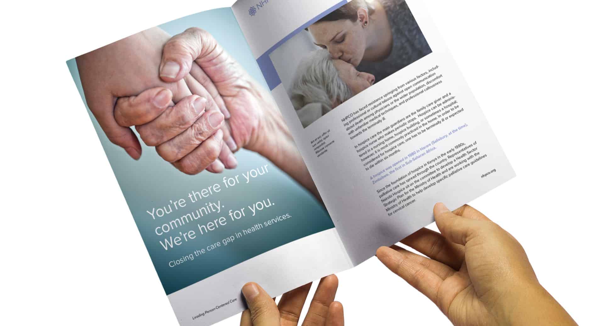
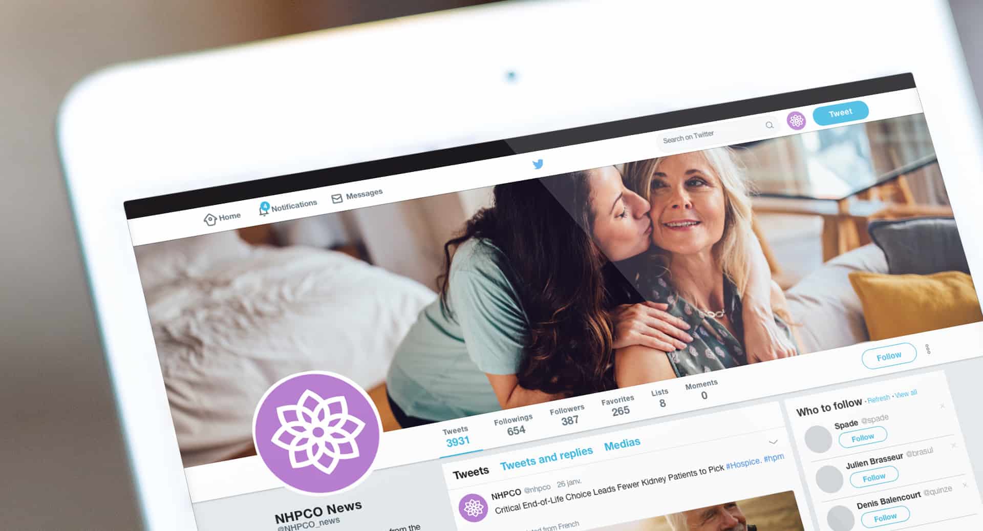
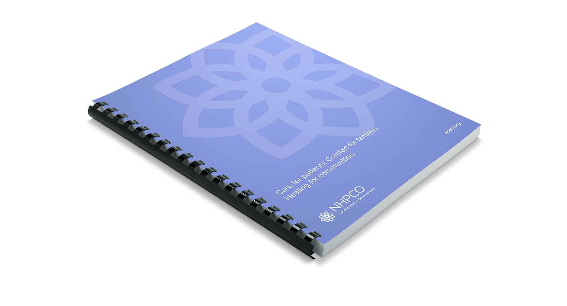
Based on the core brand messaging framework, we developed an identity system for NHPCO that resonates with the organization’s vision: a world where individuals and families facing serious illness, death, and grief will experience the best that humankind can offer. We created a clean stationery system that provides refreshing lightness, mirroring NHPCO’s focus on compassionate, patient-centered care. The printed collateral includes close-up imagery of caregivers working with hospice and palliative care patients as well as family members spending time with their loved ones, illustrating NHPCO’s role in helping caregivers to offer relief in difficult situations. These images communicate feelings of security and comfort, as members depend on NHPCO’s leadership to help them provide the best interdisciplinary care for patients and families. The color palette conveys sensitivity and calm during emotional times for patients and their loved ones as they experience life-changing situations.