American Pharmacists Association
The American Pharmacists Association (APhA) has been the flagship organization for the pharmacy profession for more than 150 years. It’s the only pharmacy organization dedicated to supporting pharmacists in every stage of their careers, in every practice setting, and in every specialty area.
As an all-encompassing organization, APhA needed to establish a new brand identity and story that a broad membership could relate to, feel inspired by, and want to engage with.
Services Rendered

Process
Through the discovery process, Mekanic learned about the challenges APhA faced as the largest, oldest, and most wide-ranging organization serving the pharmacy profession. Their members’ needs have become more varied and their practice areas more specialized.
As the profession becomes more competitive for students, new practitioners, and established pharmacists alike, APhA needed to stand out as the leading voice in advocating for the entire profession, and a comprehensive resource and network for all pharmacists. In doing so, it would be better able to engage pharmacists in a long-term relationship spanning their entire career—from pharmacy school to retirement.
Advocacy for important topics such as pharmacist provider status, wellbeing, and initiatives to advance patient-centered care with integrated healthcare teams have an impact on every pharmacist, and APhA wanted to be the leading voice. In order to do so, it needed to adopt a more unified, contemporary, and accessible aesthetic and message.

Execution
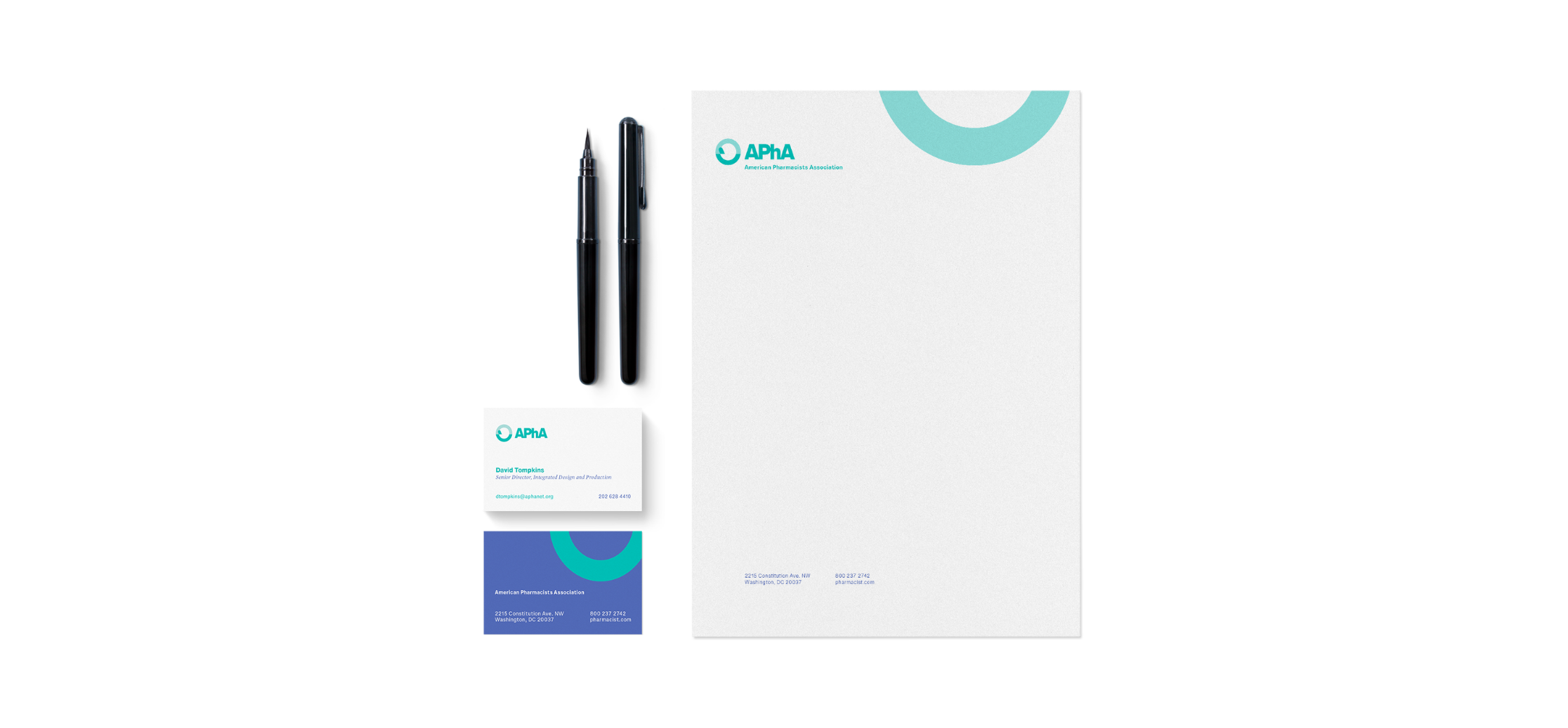
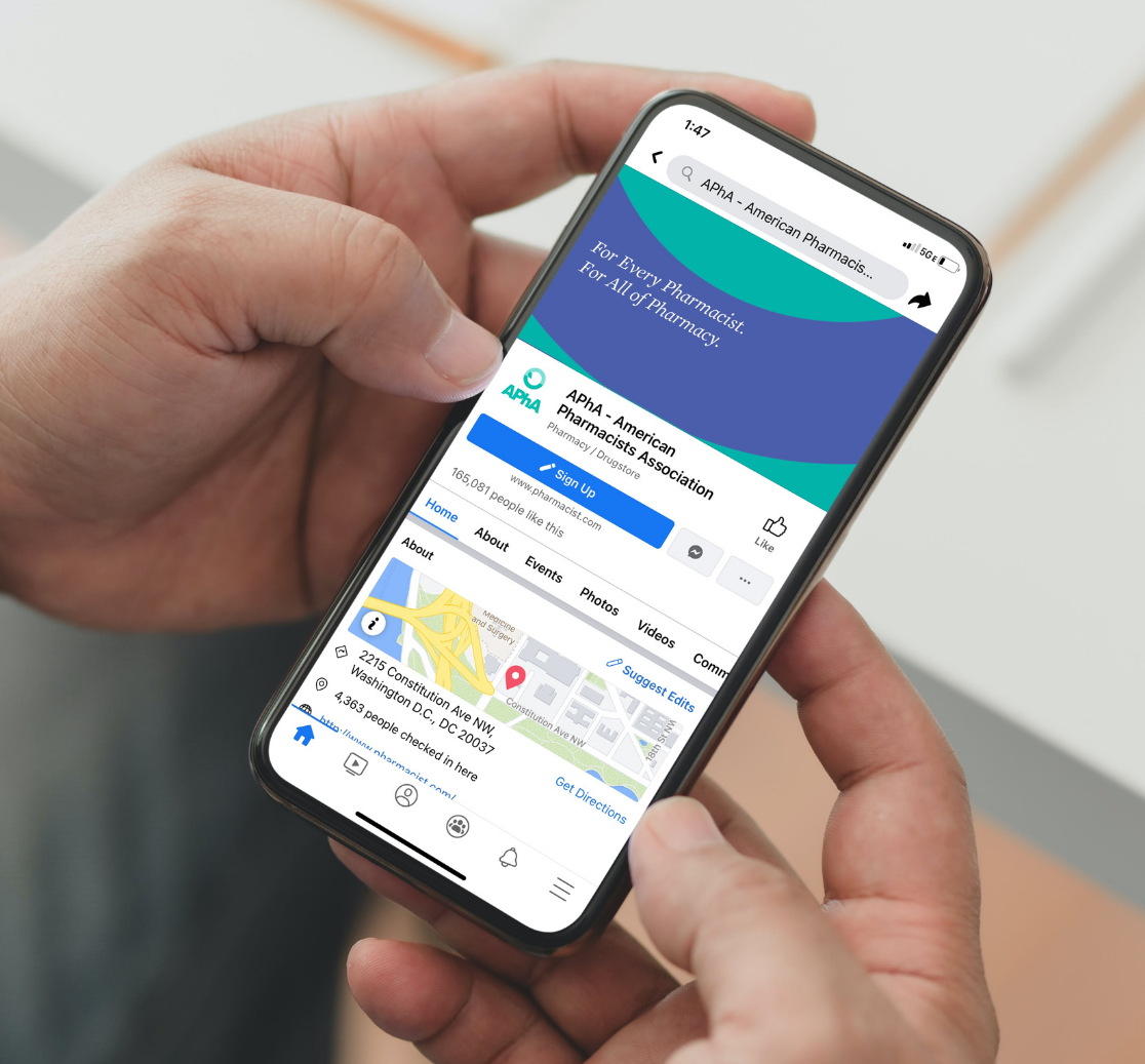
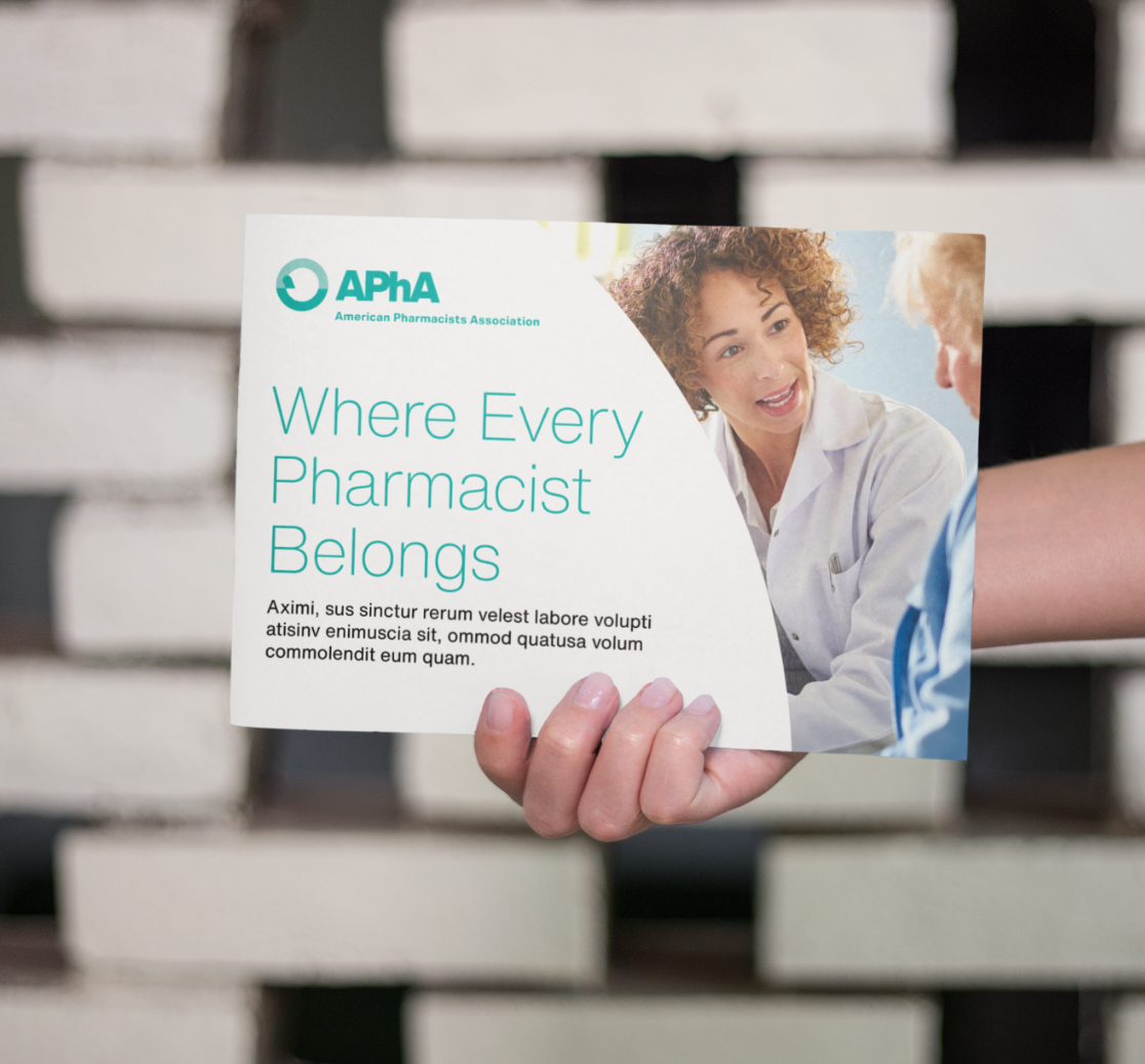
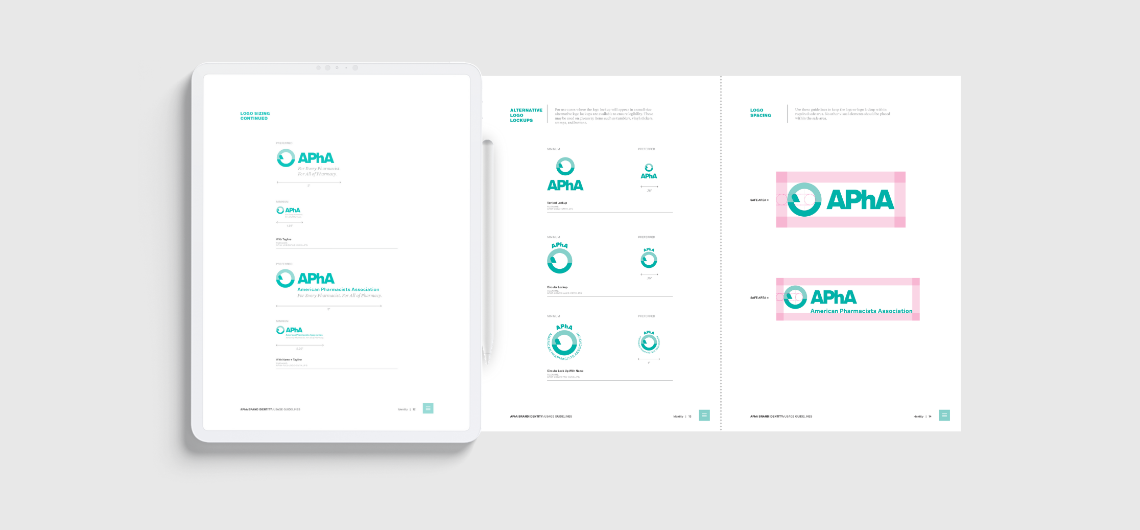
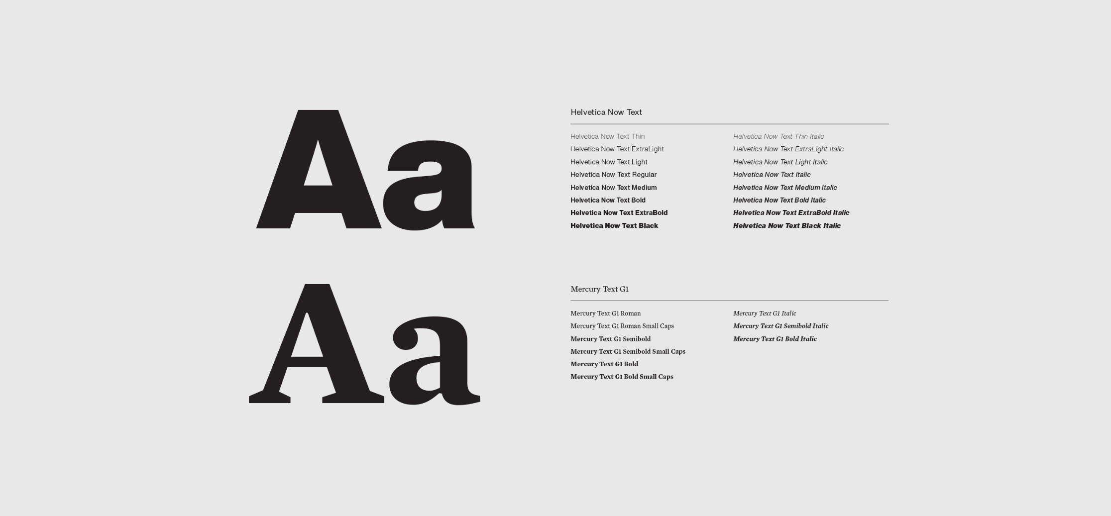
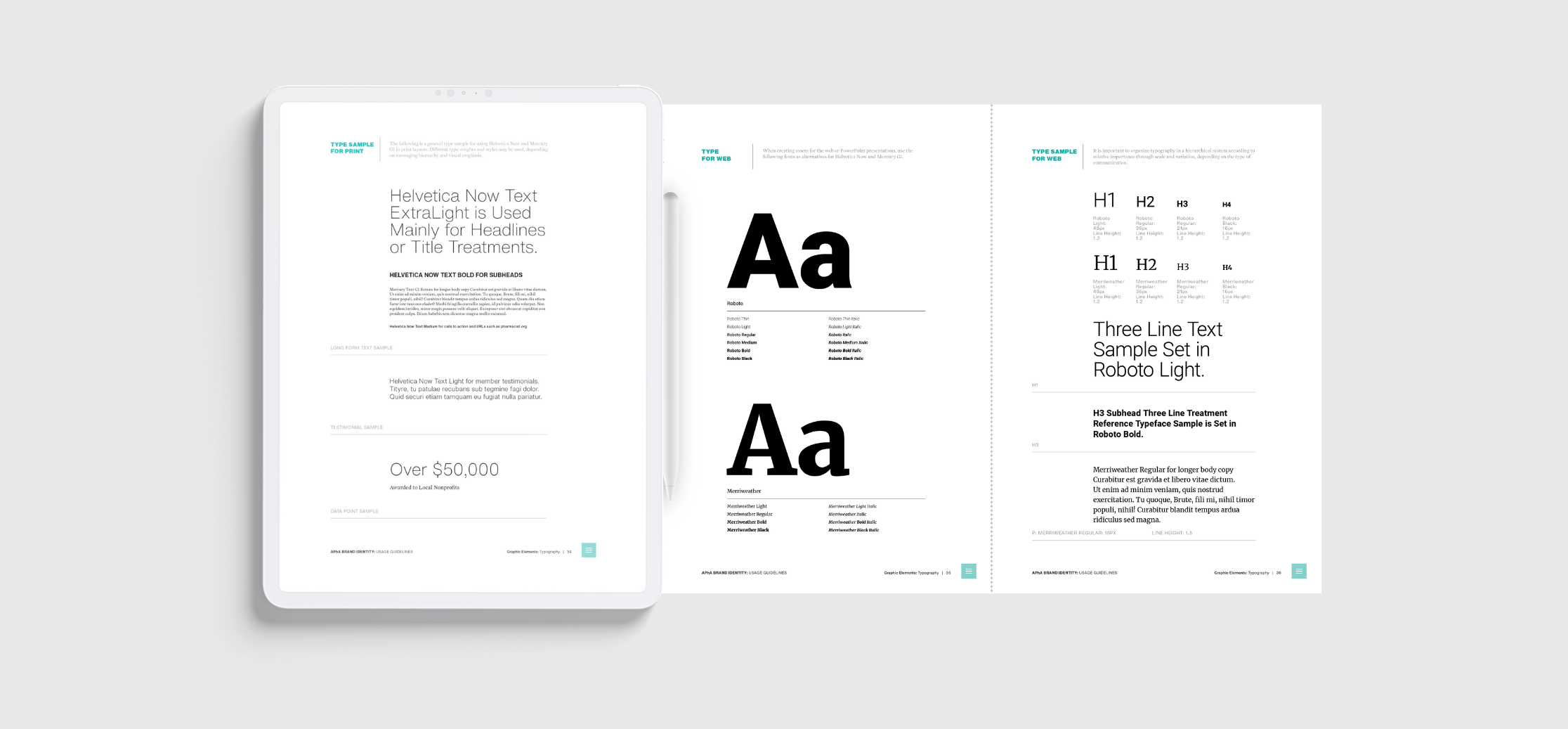
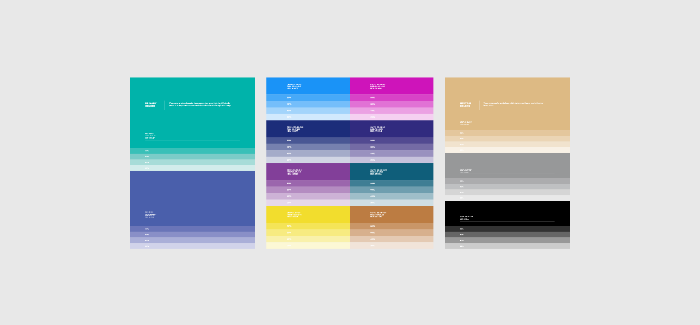
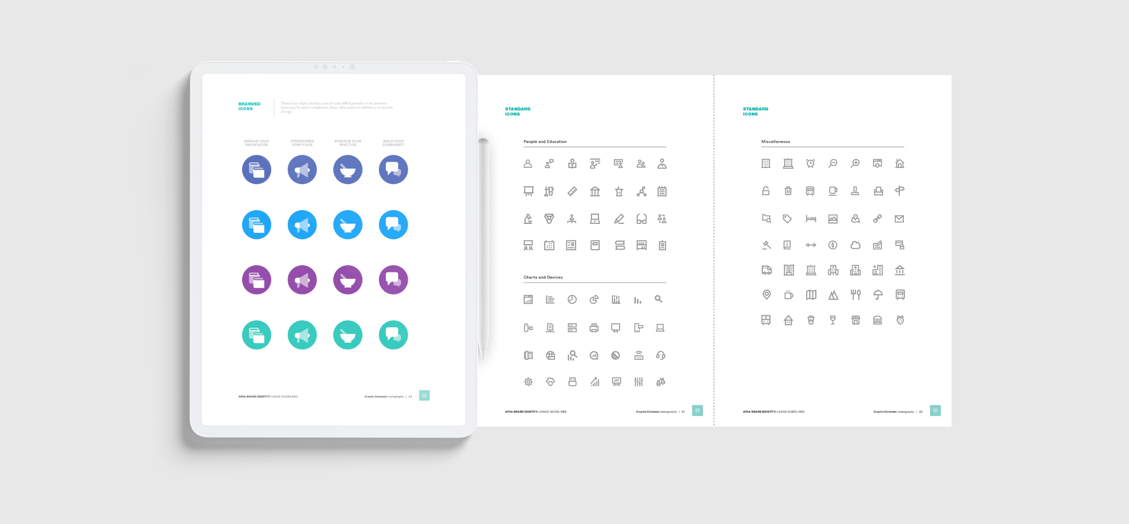
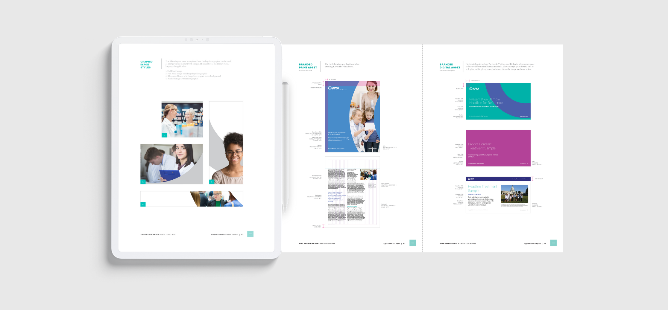
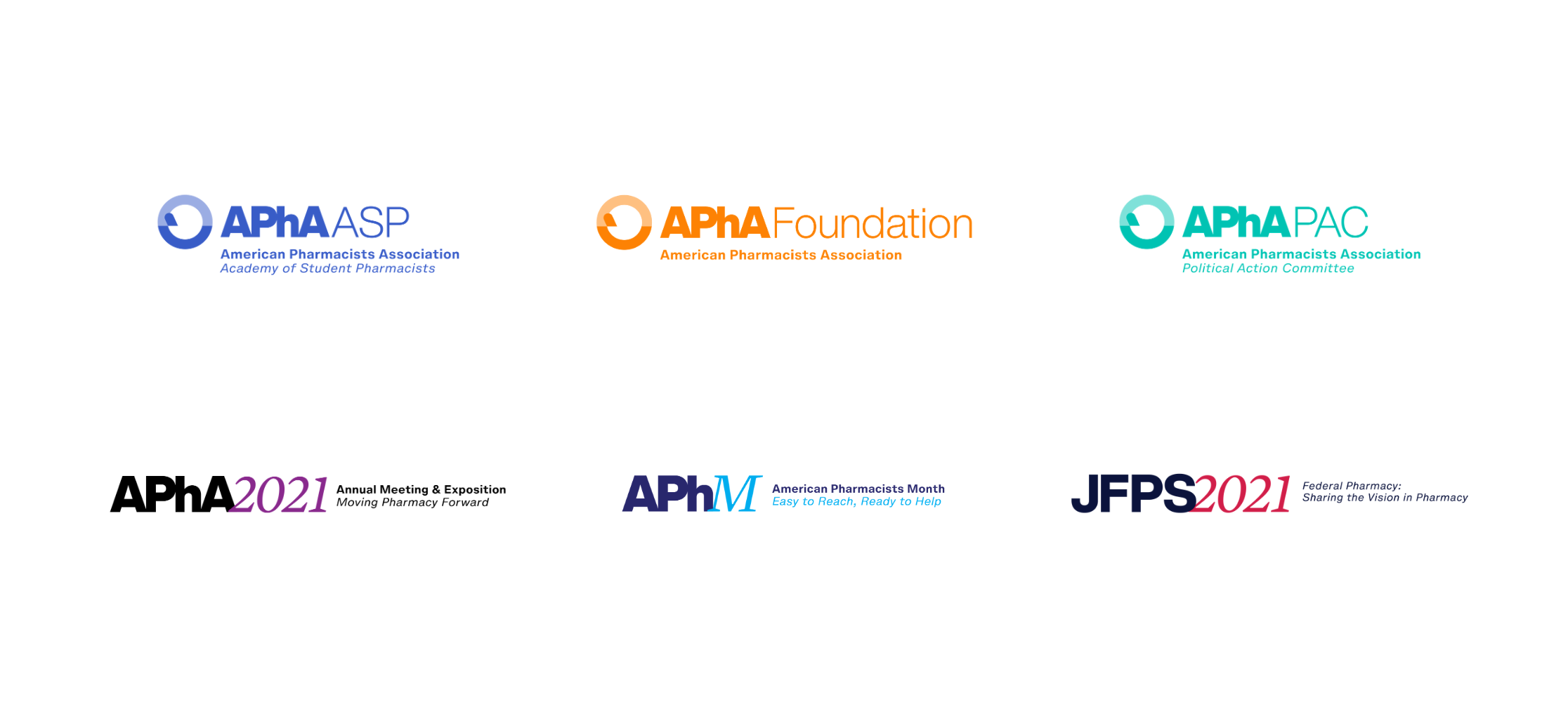
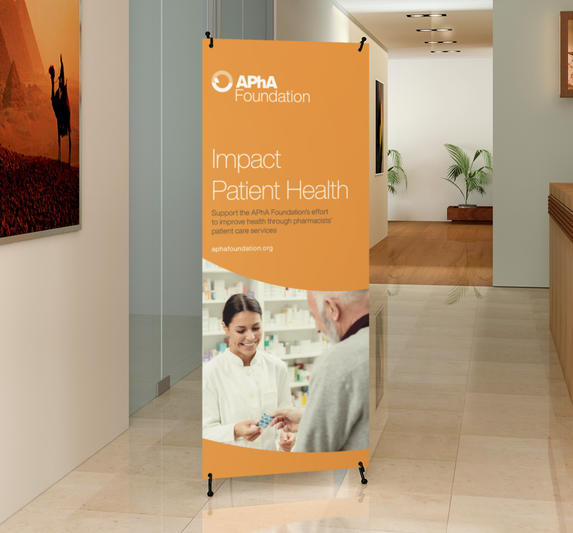
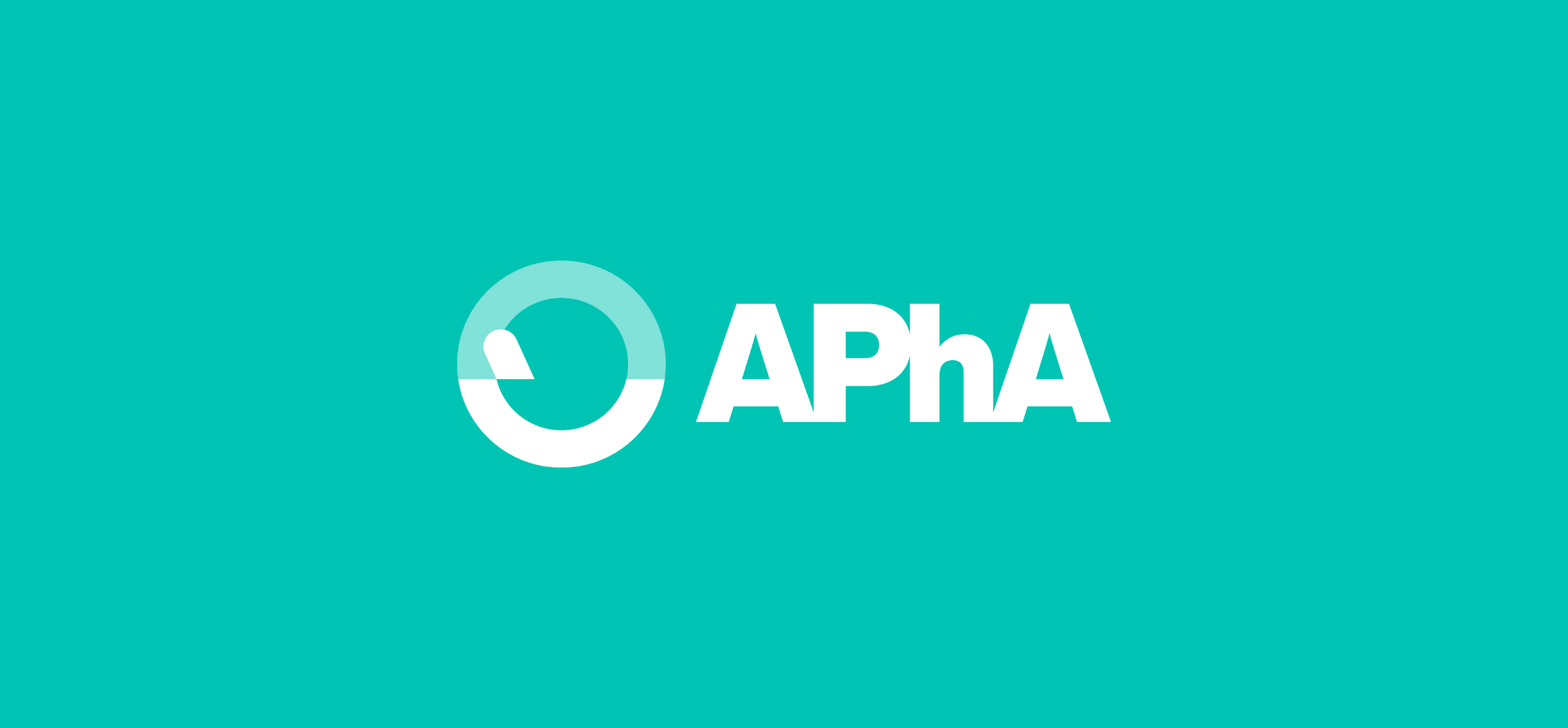
APhA adopted a new core brand messaging framework, tagline, and visual identity that positions it as the leading advocate for the pharmacy profession and on matters related to pharmacy. The new brand mark is an adaptation of the original mortar and pestle, which has been a symbol of pharmacy practice and the pharmacist’s role as the medication expert for over 100 years. Clean lines, a brighter color palette, and a minimalist approach brought the brand to life in a new, exciting, stylish way.
We also worked closely with the APhA team on its new tagline: “For Every Pharmacist. For All of Pharmacy.” It speaks to the comprehensive quality of APhA, whereas many of its closest competitors are offering niche content and resources for specific practice settings or moments in a pharmacist’s career.
Together we identified the many use cases, applications, sub-brands, and communities that would engage with the new brand in unique ways. We developed toolkits and messaging guides to introduce the changes and generate buy-in among brand ambassadors and members alike.
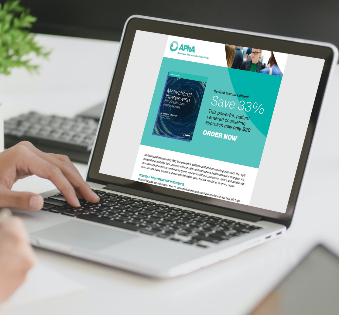
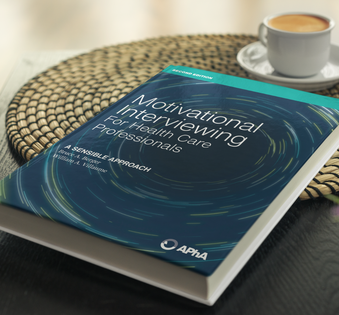
APhA brought these changes to life on updated website and continues to share its refreshed brand story and visual identity across a range of programs, services, and channels.