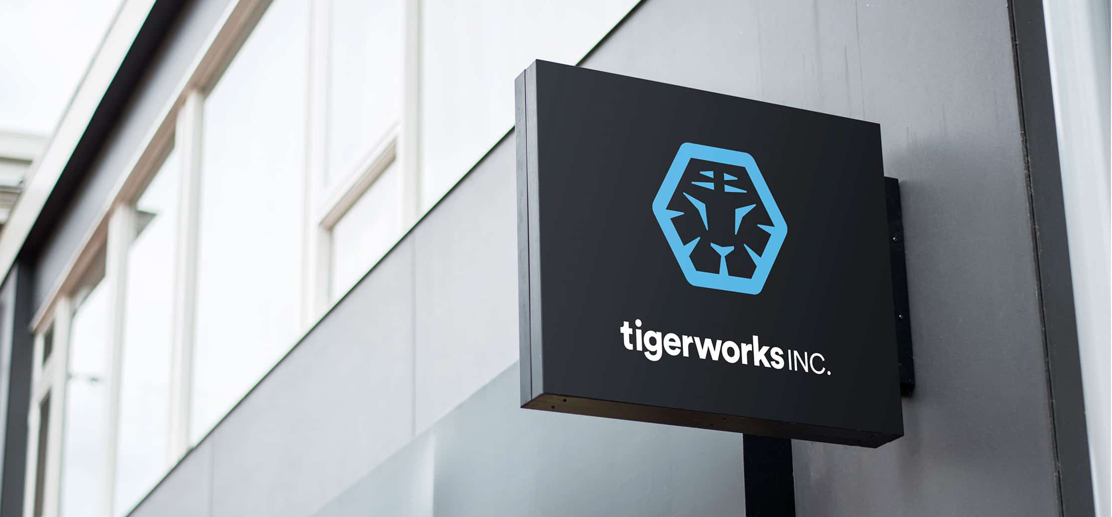
Tigerworks Inc
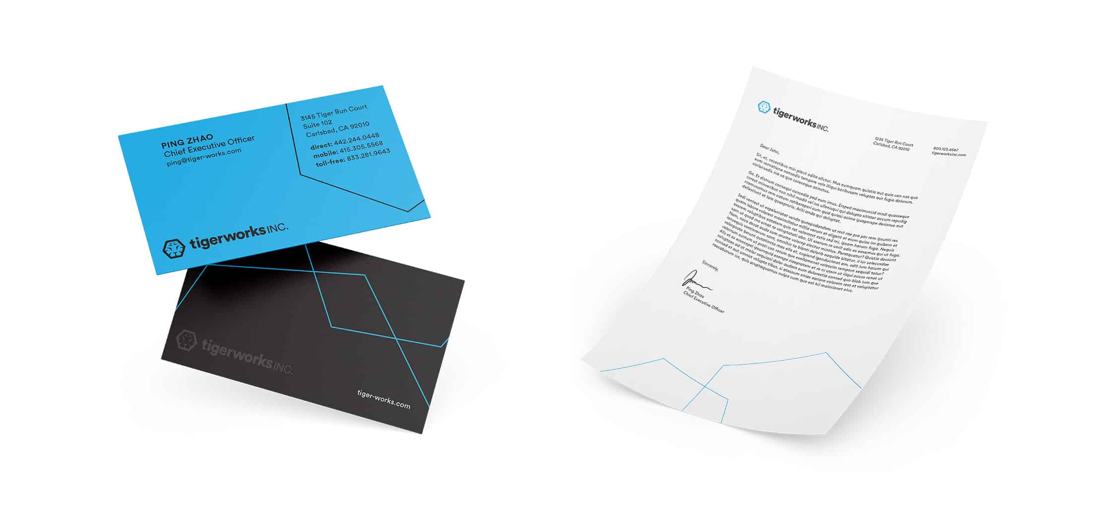
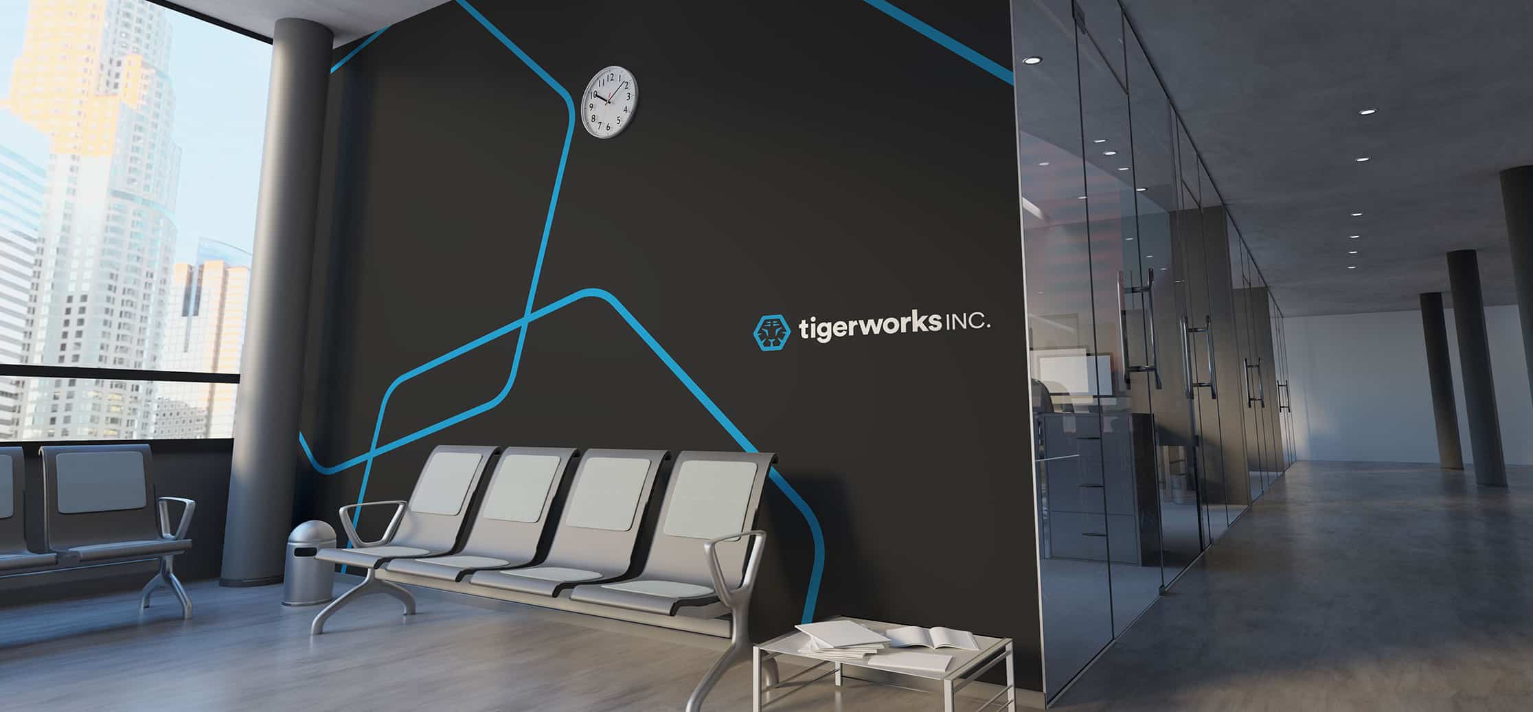
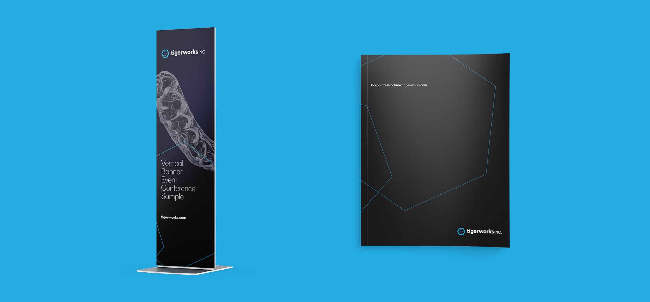
Tigerworks, a dental technology company specializing in cutting-edge products and orthodontics software, engaged Mekanic to help design a new parent brand that would unify several sub-brands and provide audiences with a cohesive experience. We designed a visual identity system, including a logo, business cards and letterhead along with operational and marketing templates to bring the new brand to life.
The name “Tigerworks” conveys the sharpness, elegance, and power of this innovative new family of brands. In the design of the brandmark, hexagonal structures with indentations and grooves are an abstract representation of a tiger’s face, and also represent the aerial view of a molar’s grooves, and the shape of a “gear”—a play on “works.” A customized typeface, called Circular, uses bold, rounded letters to create a friendly geometric shape to complement the hexagonal mark. Fresh blue exudes energy, streamlined simplicity, and a new approach to orthodonture that is user-friendly and lightyears more glamorous than your average braces. In application, touches of black-on-black lend subtle, luxe extras to branded touchpoints like business cards. The hexagonal shapes are also used in application to add texture and to inject a touch of color into brand basics like stationery.